Information Design
Information Typography - David Carson
" You have to utilize who you are in your work. Nobody else can do that: nobody else can pull from your background, from your parents, your upbringing, your whole life experience." - David Carson
I have chosen David Carson as my "Hero" for this Itap as he inspires me greatly with his influential informative typography.
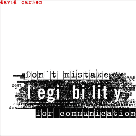
From the critiques i have read online, there is a lot of critical judgement on his work. A lot of designers/typographers are stating that within information design a piece of typography should not stand out, it should stand for the message and not be illegible. However David Carson breaks the rules with his work and a lot of his work is "not legible".
Why? well personally i think that typography should be looked at and admired as well as being just a form of information. This is what David Carsons approach is to his work.
 |
| "Grunge God" |
Born 1954, Texas, USA David states he grew up in a very bohemian environment and due to his upbringing he was a professional surfer and art directed an array of skateboarding, music and surfing magazines, one of the most famous being the music magazine RAY GUN.
His upbringing and early life has taken a massive influence on his work and i can see the "bohemian" upbringing showing through in his work. He really inspires me to release my influences and culture into my own work, even if work is produced on a business level there is always room to add my own personal touch.
A feature story in the magazine NEWSWEEK quoted:
"he changed the public face of graphic design"
I agree with this comment on the fact that he simply broke the rules on the traditional mold of typography on a page. there were other people who were doing this such as Milton Glazer, Paul Rand and Saul Bass, however David stands out to me due to his "Grunge" style and how his early life reflects on his work many years later.
His layout styles and fractured imagery are indeed very interesting to look at and visual hierarchy plays a massive role in some of his design work.
Some of his work can be labelled almost illegible and it is questioned that this does not fall under the title of information design.
I think thats BULLSHIT personally as i have always strongly believed that a word should engage an interesting visual package, as well as just portraying information.
I don't think his work would suit road sign design for instance as they need to be clear and concise for the road users. But i suppose if he wanted to do road signs then he wouldn't get the chance to be as creative. It's his creativity that has attracted a lot of big name international brands/cliental. These include Nike, Armani, Sony, Pepsi, Toyota, Levis, British Airways and due to his surfing nature, Quicksilver. Not exactly small companies, and it was his innovative designs that must have caught their attention. It was a chance for "fresh eyes" to fall upon his work whilst promoting the brands visually in a refreshing style.
 |
| Nike - Just Do It |
An example from the Nike, "Just Do It" campaign. Nikes brand identity is one that portrays energetic, positive, loud, enthusiastic behaviour and i believe they would have considered this whilst trying to locate a designer for the campaign. Davids style of work for this particular piece
A whole range of adjectives can be used for his style of typography. Words i would never use would be static, flat and straight. He smashes the traditional iron cast molds of letterforms on a page and is always demanding a pair of fresh eyes to see his work.
Slanting, Squishing, Smashing, Enchanting, Twisting, Collaborating and Devastating words on page, David Carson has always made the point that typography on a page (or on many other formats) should be a piece of art. This is something i have always agreed with and have repeatedly tried to use this "words are art" theory in my past and present work. For the future, whenever i get the chance to manipulate text i will always try and think about David Carsons' approach to the visuals and try and be as creative as he is.
A quick Experiment:
I was experimenting with different japanese/chinese calligraphy in my own time. I discovered that these can be chopped and sliced and then repositioned for good visual effect. Its pretty minimal and simple, no where near the level of David Carson, however i have just proved to myself that dicing with these fonts and any other fonts can be a great way to communicate in a more aesthetically pleasing way without ruining the actual meaning of the text. This is a technique i will develop into my own style as i progress with my Graphic Communication.
14th February 2012
Information Design
Information Typography - David Carson


No comments:
Post a Comment