What the Font?
Jan 2012
 |
| Trickartt. |
My hero for this case is a young guy named Ricky Wilson-Cloot (AKA. Ricky Trickartt).
Ricky is a Graphic Artist from the edge of London and he (like myself) has been engulfed in the music industry in the last seven years.
On his web page:
Trickart.com
Ricky states himself as a Graphic artist because he believes his work is somewhere between that of a Graphic Designer and an artist.
"This basically means that I'm not afraid to create artwork from any means or medium. My passion is in creating things for print, but I know my way around more modern platforms too".
When asked "Why do what you do?", Ricky replies "I am trying to make the world a prettier, slightly sillier place! That, and I appear to be addicted to creativity.
Trickartt has done work for numerous music organisations, like Radio 1, Prolific Records, Beta Records and my favourite Hospital Records.
I have been following Hospital Records for many years and have always been drawn towards the "Drum & Bass" music genre. Over the years i have spent cash on Hospitality music which on it's own is brilliant but i don't think the artwork gets as much credit as the music, well it never tends to!
Whilst my collection of CD's and Vinyl grew i started noticing the artwork had some really creative aspects to them. And this is where i found Trickartt.
Ricky is in charge of all things visual at hospital records and by the size of his online portfolio he has worked with several of the biggest artists on the record label. He designs everything from record covers, websites, merchandise and branding.
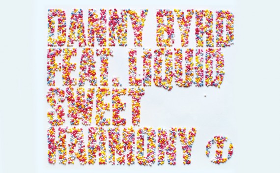
One record cover in particular was most aesthetically pleasing to me due to the expressive typographic illustration put into place.
Danny Byrd - Sweet Harmony - Single Cover.
Album Cover
Reading through his notes about this creative typography piece i find it very inspiring how he got to the idea of using the colored candies. This is how he described the process of creating this brilliant typography piece.
"I was thinking about doing something rave-related, as the original is a classic of the early 90s rave era. This got me thinking about candy ravers, which brought me around to sweets. I told Hospital about the idea, who immediately saw the pun in the track’s title, which I had overlooked until it was pointed out to me. Agh! I got to work on the idea as the visual pun was too good to ignore, but after several trips to the local sweet shop and many cover ideas using all things from red rope liquorice to candy bracelets, it just wasn’t working.
It wasn’t until the weekend, when Lilly was baking, that I found myself staring at her collection of cake decorations, thinking how much I liked the colours of them, when suddenly the idea clicked with me, and I realised the decorations were essentially tiny sweets in themselves.
HaHa Quality!!
Personally it makes me smile to see someone so into the visual side of the Drum & Bass scene. There are not many examples of artwork, or artists who are directed entirely on Drum & Bass associated visuals. Some of his work has really inspired me to take inspiration from the simplest of things.
W.T.F.
What the Font?
Jan 2012


No comments:
Post a Comment