Bal's Hero RK Joshi
Jose Parla
Bal recently gave a lecture about his "Hero", Ragunath Krishna Joshi who was a type designer and calligrapher.
I love typography and i have always had respect for calligraphers who can do it well, like RK Joshi. It takes great skill to get the right aesthetics. I am currently reading a book called "Urban Calligraphy and Beyond" by Markus Mai, 2005. The book documents some of the simplest forms of graffiti writing, often crazy ineligible words that were done in a calligraphic style.
In a slightly different style to Bal's hero, this blog is about a calligrapher with a very unique style of work.
 |
| Urban Calligraphy by Markus Mai |
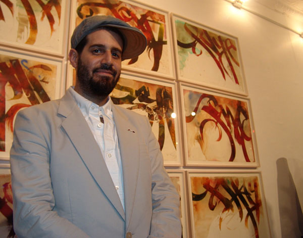
Jose Parla originally started out writing graffiti in New York as one of the traditional subway "bombers". He used the name "Ease" and riddled the cities with paintings on blank walls and spaces. Graffiti at the time was branded as a crime, no more than an act of vandalism which swung his platform. He became dedicated to transplanting his visual pieces from the streets in which they came from to professional art galleries.
“Society mostly categorised Graffiti art as vandalism, so my struggle as an artist was to show its beauty to those who could not see it,”
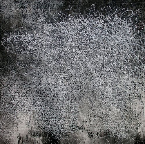
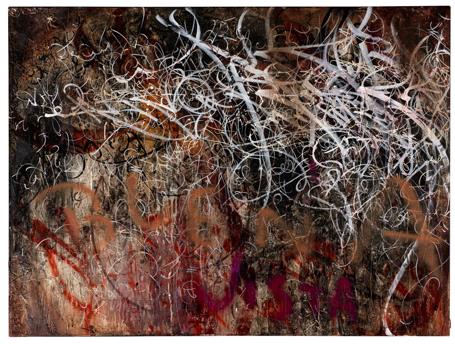
His paintings often encrypt messages and acts a front man for historical transcribe pieces. He records his experiences in a calligraphic code which is not easy de-coded. Jose Parlas unique markings appear on distressed backdrops and are formed as a combination of textual memories representing the cosmetic results of urban corrosion. The backdrops often show signs of distress, city walls being charred and chipped with layers of paint, old posters and a general texture which resembles acts of deep seeded urban decay.
His work reaches out to people by using a narrative aesthetic, in which it can translate moments of time that can only be conveyed by visual dialogue. His work is highly textured and has drawn inspiration from urban walls. He often uses such materials as oil paints, spray enamel, saw dust and dirt which are all stunningly punctuated by his tag style signature.
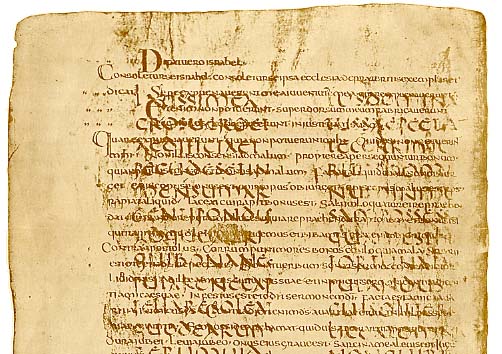
His work can sometimes resemble a palimpsest, with heavily filled writing and compressed sizes. Art historian Michael Betancourt dives his work into 3 separate categories; walls, diaries and pictures, and he quotes:
“What Parlá’s work provides to its viewers is a way to re-see the city and re-engage the value of urban life"
 |
| Palimpsest Manuscript/scroll |
These forms of typography are especially interesting for me because they are ineligible. I love to see work that can slightly confuse it audience, who struggle to de-clutter the visual messages inside. It all reflects the urban environment, with its complexity and hidden stories.
It's nice to see such unique styling in a form of graffiti, shying away from bright colours and block letter, i find Jose Parlas work a lot more fluid and flowing with great composition and structure.
 |
| From Streets, to Art Gallery |
13th April 2012
Bal's Hero RK Joshi
Jose Parla


